Fast checkout
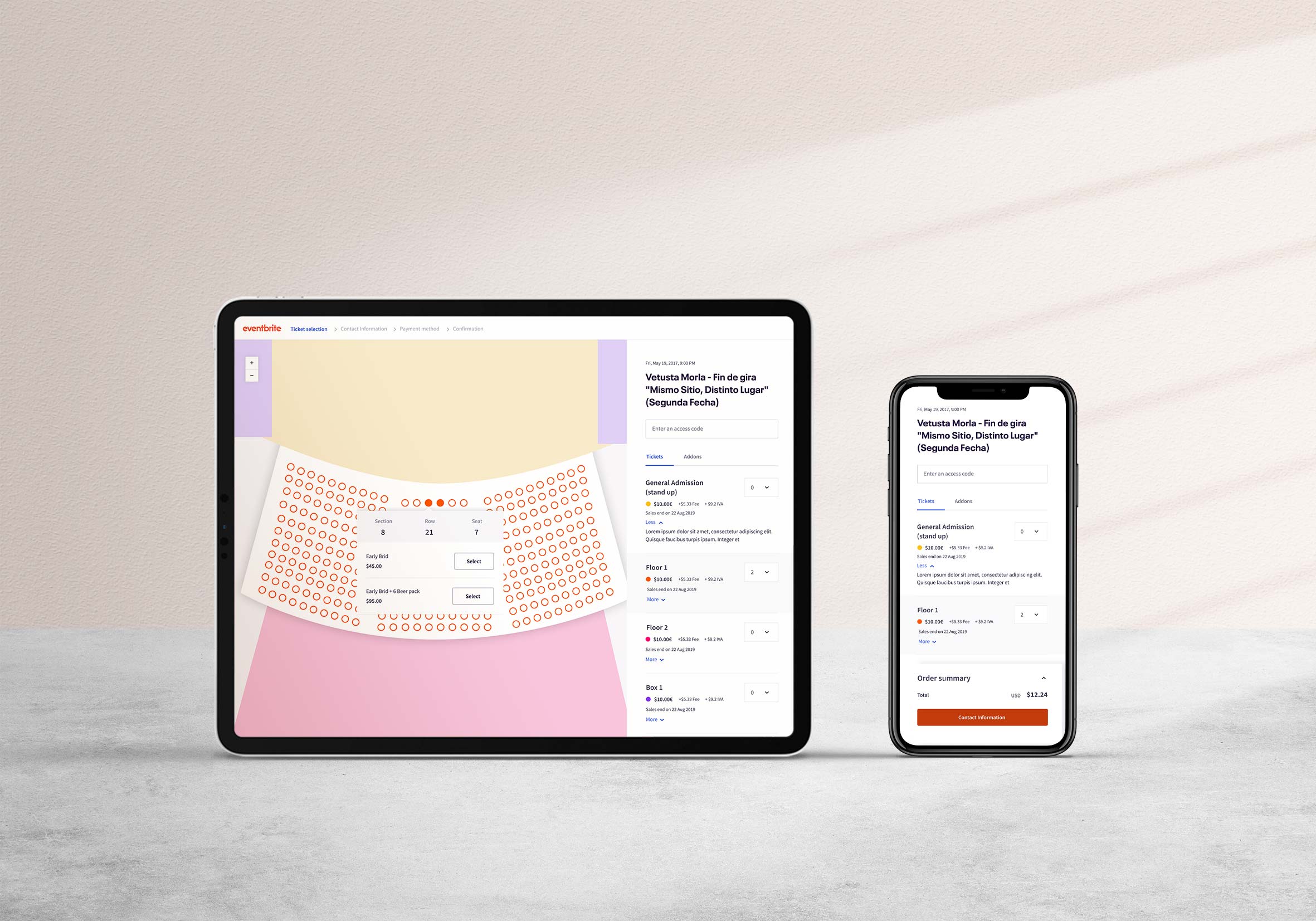
The checkout process was by far the most sensitive moment of the event experience as the ultimate goal of creating an event is make conversions.
For this matter, streamlining the process was paramount to satisfy both, attendees and event creators.
I dedicated nearly 4 months to speed up the process, In this case, I explain how.
Conversion rate
↑12%
Checkout Abandonament
↓7%
Time to Checkout
↓1.2 min
The problem
Removing friction to make the checkout process a breeze
In 2019, Eventbrite faced significant checkout drop-offs, primarily due to user friction from lengthy form filling and unnecessary extra steps.
Consequently, the platform experienced a 54.06% abandonment rate, which had a detrimental impact on user satisfaction and event organizers' conversion rates.
Checkout Flow
01
Introducing a stepper
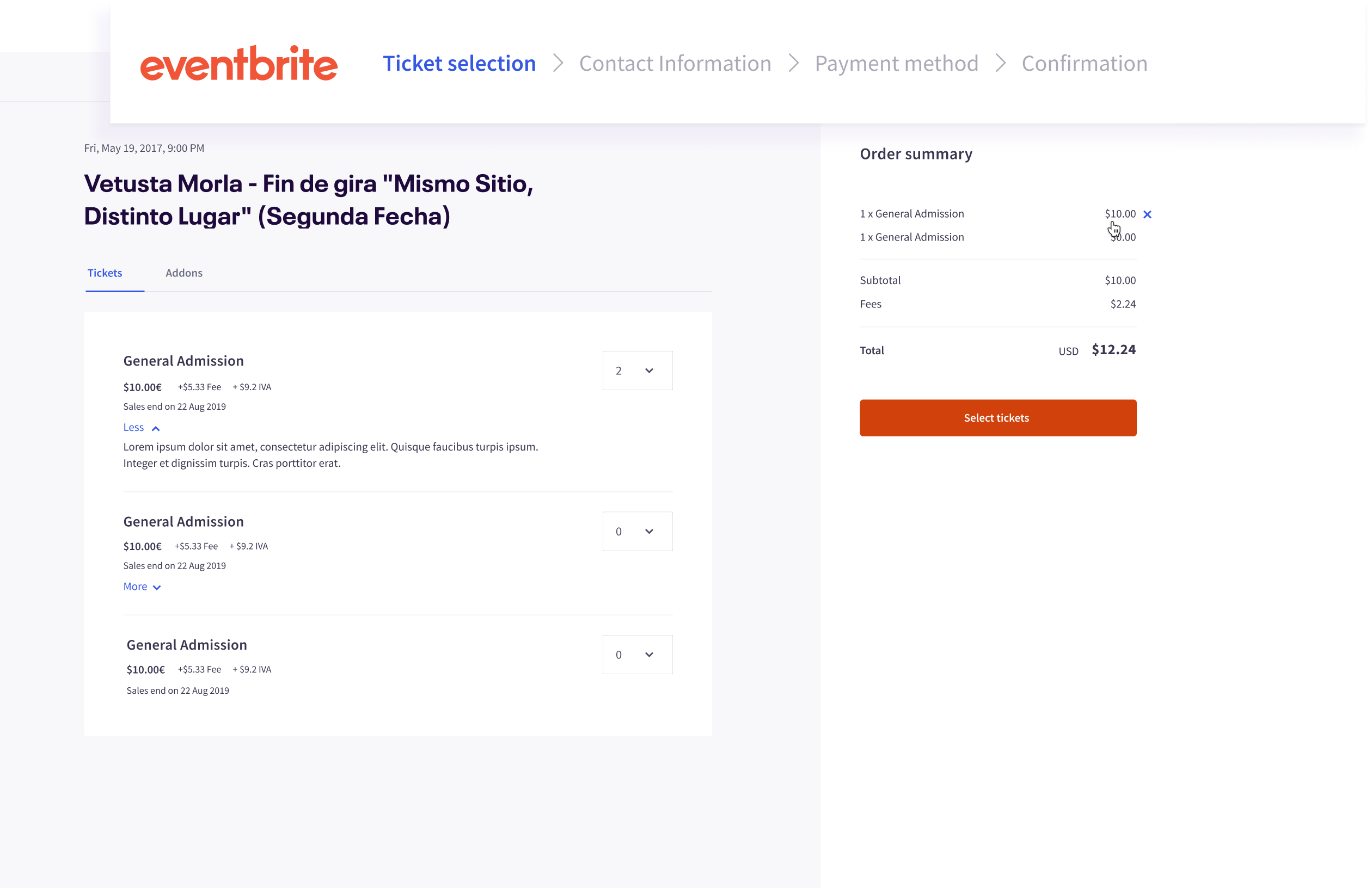
To address a major drop-off during the detailed form-filling stage, I added a stepper at the top of the checkout process, clearly outlining each step to reduce uncertainty and improve completion rates.
02
Experimenting with CTAs
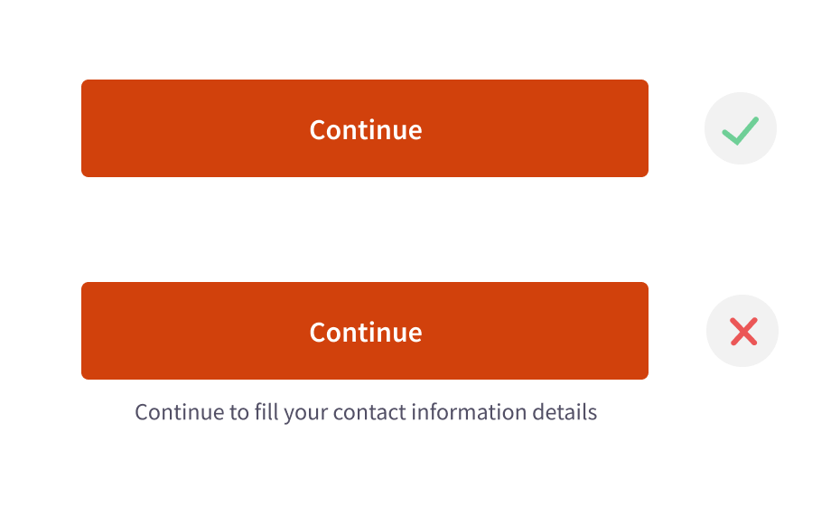
I wanted to test the hypothesis that splitting the checkout into steps would make it clear that clicking the CTAs would lead to the next step.
The steps themselves guided users effectively, and extra CTA text wasn't needed. This hypothesis was correct, as users found it cumbersome to read CTA texts.
03
Full Screen
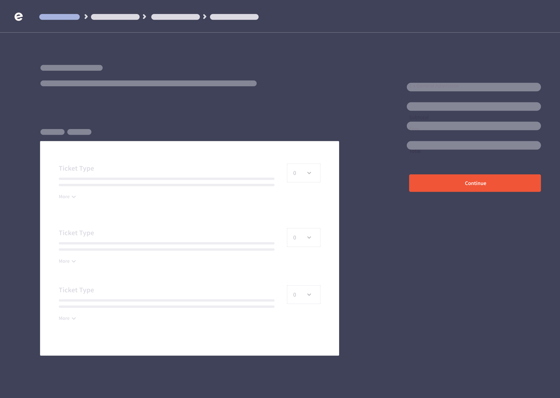
By positioning the process steps at the top of the page, utilizing full-screen mode was a natural choice to maximize space. I enhanced the visibility of the primary CTA by embedding it within the order summary.
This approach allowed us to reinforce user progression alongside the steps effectively
04
Streamlining decision/making
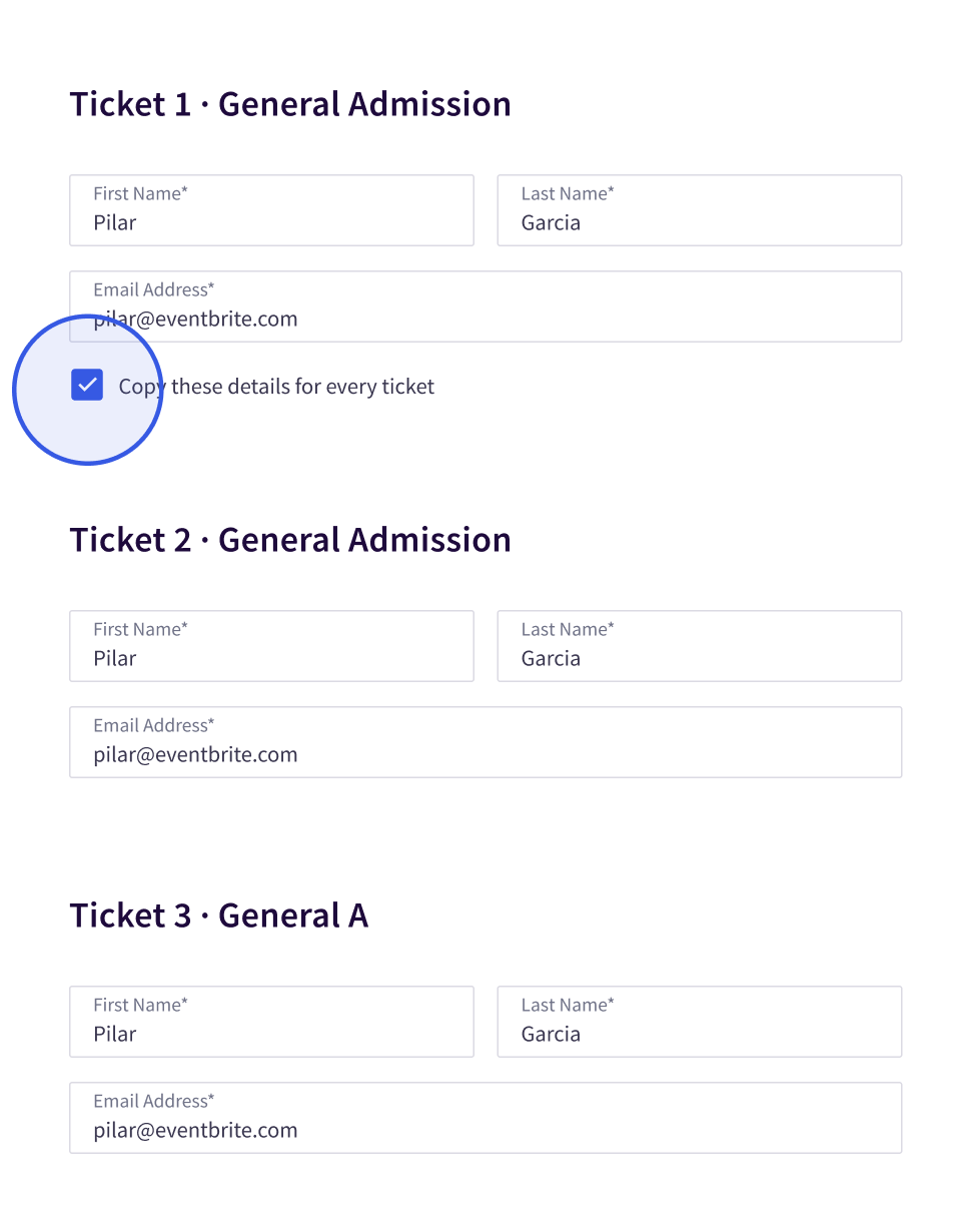
Filling up the contact details was another critical decision.
The users must add names/addresses to every ticket already selected. This process is tedious, especially when you have to fill up the information for more than 1 ticket. We realized nearly 80% of users copy their data for every access. So I implemented a check button to automatize it.
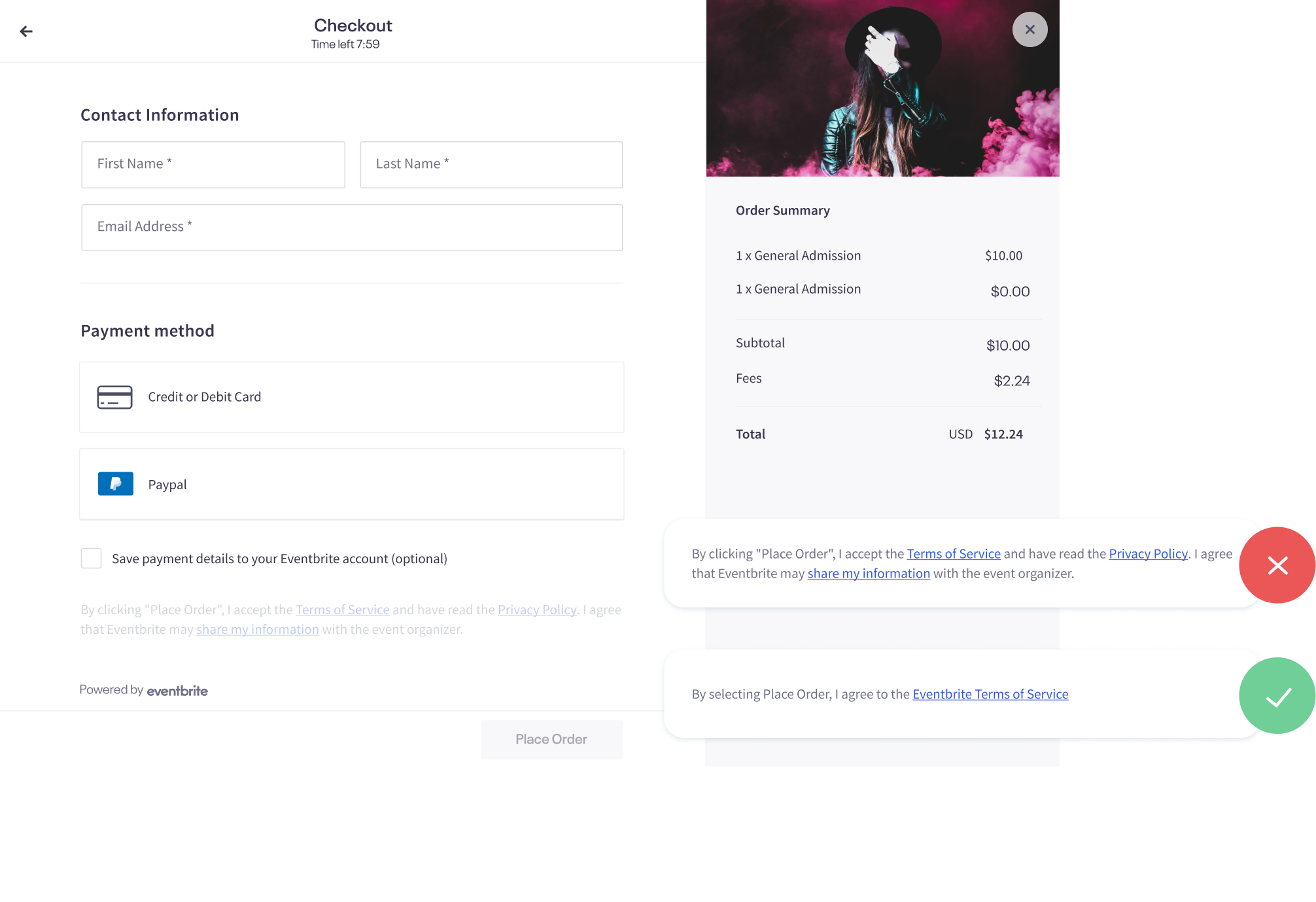
User engagement with privacy policies and terms of service showed that three separate checkout footer links caused distractions.
After testing, we streamlined by consolidating the links into one, minimizing redirections.
Login inside checkout
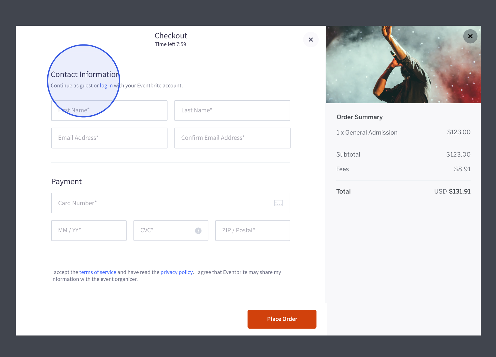
Previously, users were required to exit the checkout process to log in during a purchase, contributing to the second most common cart abandonment reason after additional costs.
Embedded Login Process
Integration of the login process within the checkout for users who have initiated ticket selection.
Default Guest Login
We simplified checkout by defaulting to guest login, reducing extra steps for tasks like account creation. Users could complete these tasks post-checkout for a smoother experience.
Payment methods
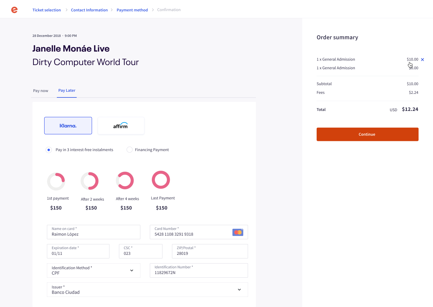
Buy Now, Pay Later
In 2020, BNPL became a major payment trend. By 2025, the global industry is set to grow 10-15x.
To combat cart abandonment, I integrated BNPL seamlessly into Eventbrite's checkout process, maintaining a consistent user experience.
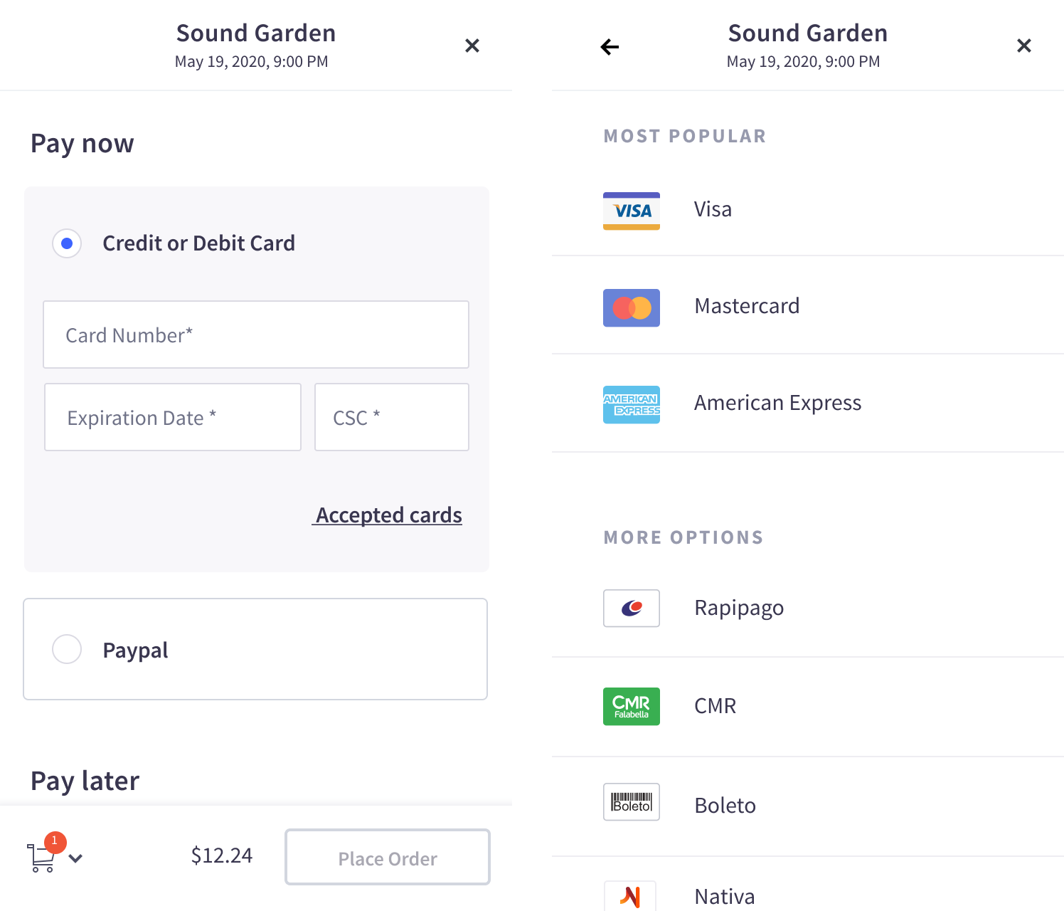
Streamlining country-specific mobile payment features
We customized the checkout to match country-specific payment preferences. For example, 80% of U.S. users preferred Visa or Mastercard, while installment payments were favored in Argentina.
To scale efficiently, we focused on regions where Eventbrite had the largest market share and created flexible components.
Social Login
PayPal, Apple Pay, Google Pay, and other fast ways to complete online purchases have heightened convenience in purchasing.
They were especially vital for event creators, as these methods streamlined transactions, resulting in smoother processes, increased ticket sales, and enhanced attendee satisfaction.
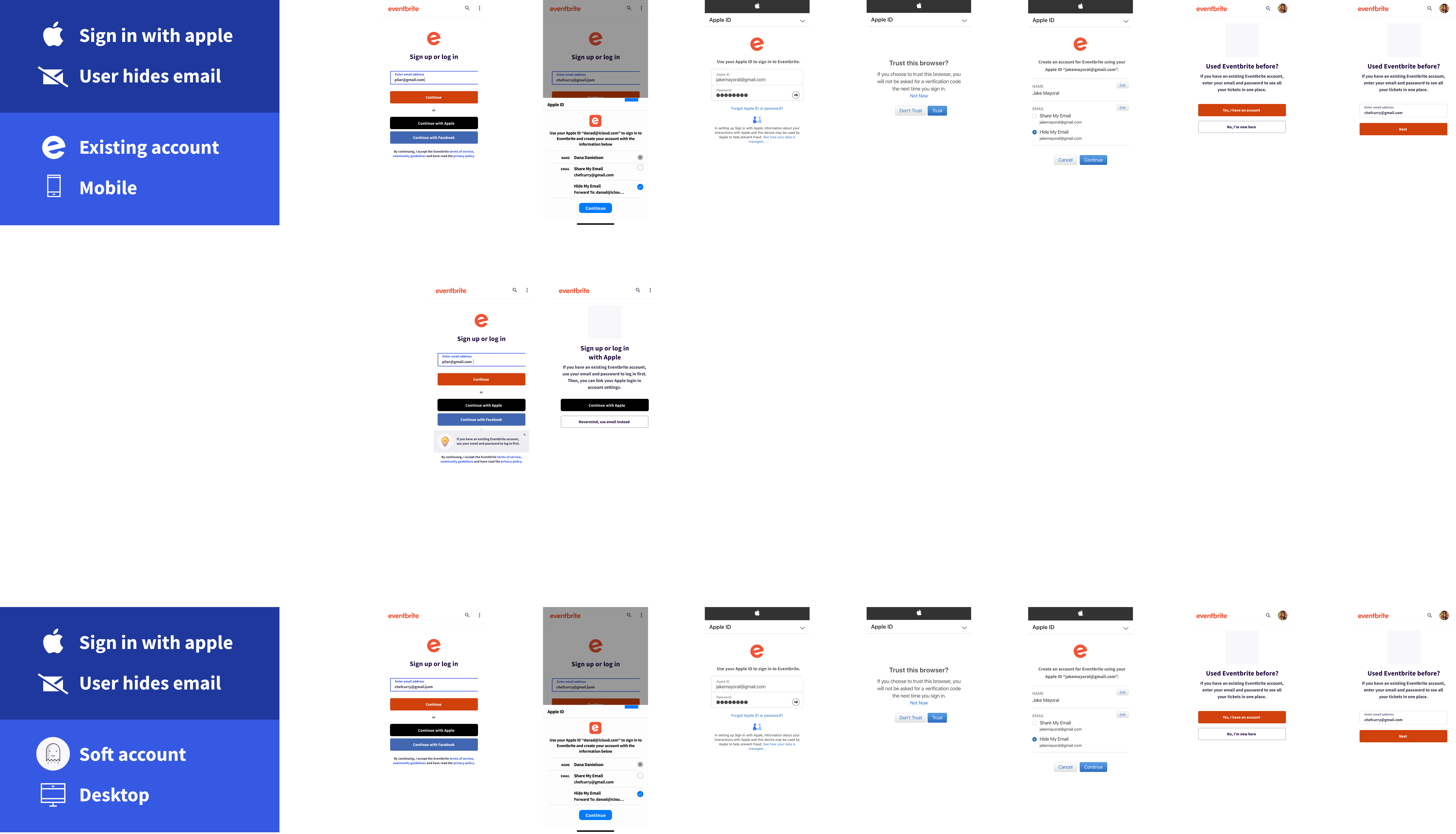
Facebook login
To boost login rates, we've incorporated Facebook login into the checkout, focusing on enhancing its low 10% login ratio.
Apple login
We integrated Apple services to streamline the login process, benefiting nearly 32% of our users already using Apple-related login methods in 2020.
Takeaways to design for scale
Realistic use cases
When designing, it's crucial to account for the actual scale at which users operate, rather than relying solely on simplified representations of their environments.Neglecting real-world complexity can lead to barely usable designs.
Scalability and relevance
To stay relevant in the rapidly changing business and technology environment, avoid unscalable designs that lead to costly, frequent redesigns; instead, embrace a modular, adaptable approach with reusable components and industry trend awareness.
